Android 11 Developer Preview 2 Features
New Notifications Shade UI
Android’s notification shade has undergone many UI changes over the years. Arguably, it has seen the most number of changes. It seems every new Android update tweaks a few things here and there in the notifications UI. Android 11 Developer Preview 2 introduces gaps between different notification sections. The gaps are wide and far more obvious than they used to be in Android 5.0. Aesthetically, I’m not a fan but they do help better categorize all your notifications. But then, the huge gaps also stretch out your notifications list considerably. That makes it feel more cluttered and not as organized as Google would think. Hopefully, this change will not be sticking around for long.
Hide Silent Notifications
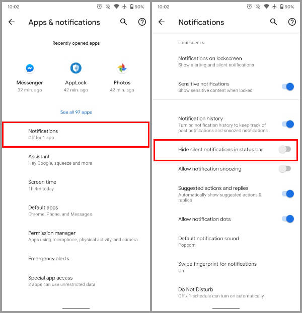
Another change related to notifications arrives in the notification settings. I don’t know about you when I make a notification silent it’s usually because I don’t want to see an icon in the status bar. That never works because silent notifications don’t do that yet. Fortunately, Google has noticed. Android 11 now includes the option to hide silent notifications from the status bar. This can be enabled in Settings > Apps & notifications > Notifications > Advanced.
Notification History Shortcut & Toggle
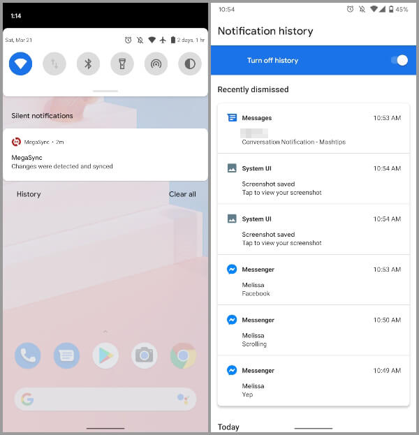
We’ve all probably at some point in time swiped away a notification and then regretted doing it. Apparently somebody at Google has done it too. We discovered Google was revamping the hidden notifications history interface in DP1. Now in Android 11 Developer Preview 2 Notification history is live for everyone. Under the notification shade, the Manage button is now replaced with History. Tapping on it takes you t the notification history page. This lists all the notifications you’ve dismissed throughout the day. Recently dismissed notifications are listed in a separate section at the top. Notification history can also be easily turned off with a toggle.
Mark Conversation Notifications As Important
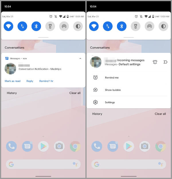
Google is also taking a page out of Gmail’s book and putting it into Android notifications. In Android 11 Developer Preview 2 you can mark conversation notifications as important. To do this, long-press on a conversation notification and you’ll be presented with a new UI to tag or tweak. A conversation marked important will appear at the top of your notification shade. Future notifications from the same contact will also have a profile icon. This will make it appear more prominent in the notification shade.
New Screen Recorder UI
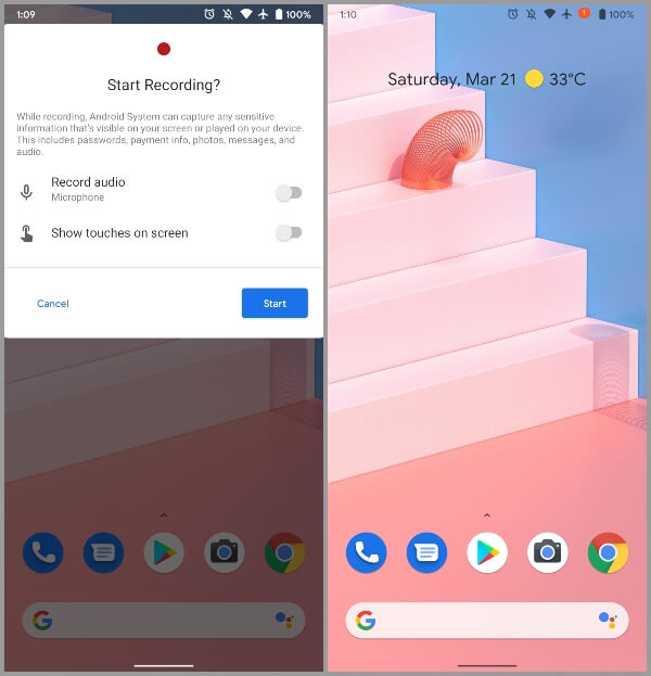
Android 11 Developer Preview 1 brought a native screen recorder. Android 11 Developer Preview 2 improves on the barebones recorder. For one, it provides a decent UI. The new interface allows you to customize your screen recordings. It also gives users some rudimentary controls. This includes the ability to show on-screen touches, and record microphone audio. Like iOS, there’s also a countdown in the status bar for when recording starts. The feature is also now more stable than before.
Pixel Theme Features & Tweaks
When you long-press on the home screen and go to Styles & wallpapers, you get more options than before. Android 11 Developer Preview 2 adds a new lock screen clock customization. Right now there are no other clocks to choose from. We expect there to be some in the next preview. It would also be nice if Google opened this up to third-party developers. Other than that, the Wallpapers tab has a new interface as well. It looks a bit cleaner and is easier to navigate. Also read: How to Get Google Search Bar Back on Android Screen?
Pixel 4 Face Unlock Now Requires Eyes To Be Open
Pixel 4 marked a major shift in the Google Pixel lineup. It dropped the fingerprint reader in favor of an iPhone-like Face Unlock. This feature still works even if your eyes are closed though which is a potential security risk. Finally, Google is fixing it in Android 11 DP2. Hopefully, this feature will arrive on the Pixel 4 in a Pixel Feature Drop. Previously, some of the Android 11 DP1 features have similarly made it to Pixel devices.
Simulate Hole Punch & Waterfall Displays
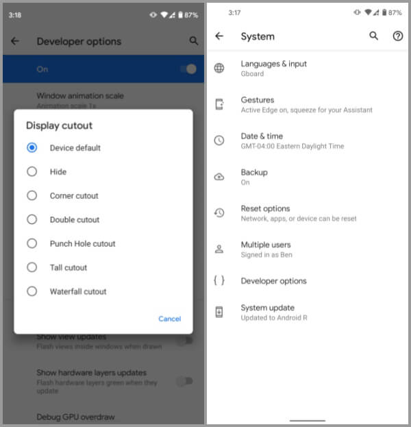
Android 11 DP1 arrived with better support for different kinds of displays. Android 11 Developer Preview 2 adds simulation support for these. If you dig into developer options, you can find several new options. These let you simulate a hole punch or waterfall display in developer options.
“Tap to restart” Makes Apps Fit Aspect Ratio
Android smartphones have traditionally adopted the 16:9 aspect. Almost all Android phones use an 18:9 or taller aspect ratio. Thus, some older apps don’t fit right. If you stumble upon such an app, you will see a popup at the bottom. This popup gives you the option to restart the app and make it full screen.
Synchronized IME Transitions
Google is also adding some finish and polish to Android 11 with the Developer Preview 2. New APIs will allow developers to synchronize their app’s content with the input method editor. In other words, when you bring up the virtual keyboard there will no longer be a sudden push to your app’s contents. Instead, the content will slide up along with the keyboard.
Android 11 Release Timeline
We’ve already mentioned the release timeline for Android 11 in our coverage of Developer Preview 1. As per this timeline released by Google, Android 11 will be released sometime in Q3. We’ve just got the second developer preview in March. If all goes right we can expect Developer Preview 3 in April. Android 11 Public Beta releases will start in May.
Δ


![]()
